1.依赖准备
import os
import numpy as np
import pandas as pd
import matplotlib.pyplot as plt
首先导入相关依赖库,pandas/numpy用于数据处理,os用于改变路径,matplotlib用于数据可视化。
2.数据准备
os.chdir('D:\soft\PyCharm Community Edition 2024.1\study\pythonProject\exercise')
data = pd.read_excel('data_1\附件三_末端位置的相对距离.xlsx')
进行数据读取,数据以DataFrame类型储存在环境中。
3.数据观察
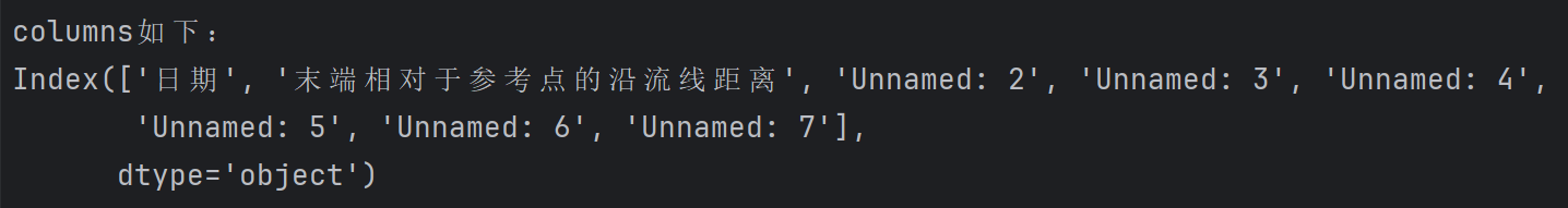
3.1 观察变量(数据列名称列表)
print("columns如下:")
print(data.columns)
print()
3.2 观察数据形状
print("shape如下:")
print(data.shape)
print()

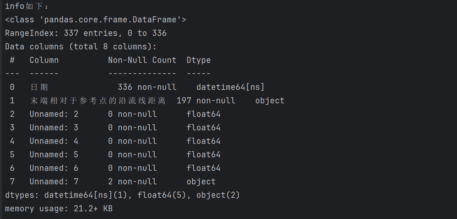
3.3 观察各列数据类型
print("info如下:")
data.info()
print()
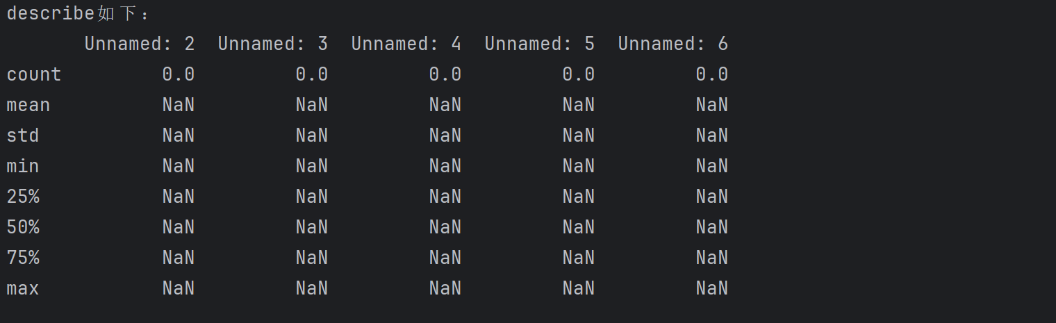
3.4 观察统计信息
print("describe如下:")
print(data.describe())
print()
4.数据清洗
4.1 数据类型转换
4.1.1 将str转换为float
cleaned_data['末端相对于参考点的沿流线距离'] = pd.to_numeric(cleaned_data['末端相对于参考点的沿流线距离'],errors='coerce')
cleaned_data['末端相对于参考点的沿流线距离'] = cleaned_data['末端相对于参考点的沿流线距离'].round(2)
将距离列转换为数值类型,无法转换的值变为NaN,并保留两位小数
4.2 缺失值处理
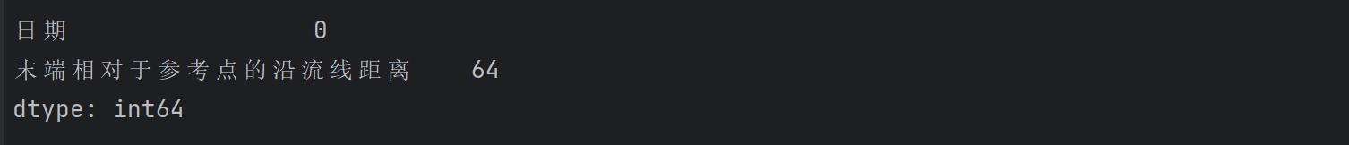
4.2.1 查看缺失值
print(cleaned_data.isna().sum())
4.2.2 查看缺失比例
print(cleaned_data.apply(lambda x: sum(x.isnull()) / len(x), axis=0))

4.2.3 删除法
1. 直接删除法
cleaned_data=cleaned_data.dropna()
2.有缺失就删除
cleaned_data=cleaned_data.dropna(how='any',axis = 1 )
3.全部缺失才删除
cleaned_data = cleaned_data.dropna(how='all', axis=1)
4.基于变量缺失
cleaned_data=cleaned_data.dropna(axis = 0,how='any',subset=['日期'])
4.2.4 插值法
1. 线性插值
cleaned_data['末端相对于参考点的沿流线距离'] = cleaned_data['末端相对于参考点的沿流线距离'].interpolate(method='linear')
2. 多项式插值
cleaned_data['末端相对于参考点的沿流线距离'] = cleaned_data['末端相对于参考点的沿流线距离'].interpolate(method='polynomial', order=2)
3. 样条插值
cleaned_data['末端相对于参考点的沿流线距离'] = cleaned_data['末端相对于参考点的沿流线距离'].interpolate(method='spline', order=3)
4. 最近邻插值
cleaned_data['末端相对于参考点的沿流线距离'] = cleaned_data['末端相对于参考点的沿流线距离'].interpolate(method='nearest')
5. 线性插值向前填充
cleaned_data['末端相对于参考点的沿流线距离'] = cleaned_data['末端相对于参考点的沿流线距离'].fillna(method='pad')
6. 线性插值向后填充
cleaned_data['末端相对于参考点的沿流线距离'] = cleaned_data['末端相对于参考点的沿流线距离'].fillna(method='backfill')
4.3 重复值处理
4.3.1 查看重复值
print(cleaned_data.duplicated())
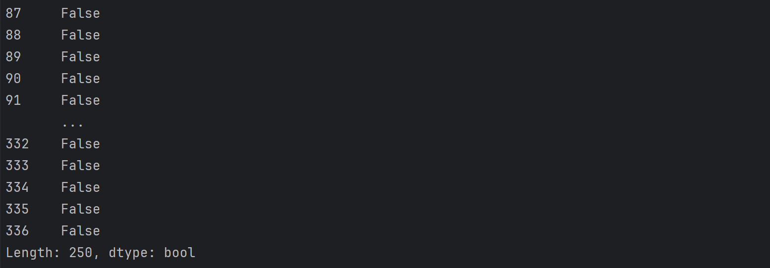
当出现重复值时显示为True,反之为False。
print('数据集是否存在重复观测: \n', any(cleaned_data.duplicated()))

4.3.2 查看哪些数据重复
print(cleaned_data[cleaned_data.duplicated()])

4.3.3 计算重复数量
print(np.sum(cleaned_data.duplicated()))

4.4 异常值处理
4.4.1 箱线图
箱线图是利用最小值,第一四分位数(Q1),中位数(Q2),第三四分位数(Q3),最大值来描述数据的一种方法。
那么,如何利用箱线图来对异常值进行处理呢?
引入一个概念——四分位距(IQR):求解方法是Q3与Q1之间的差值即IQR = Q3-Q1;设定小于Q1-1.5IQR 与大于Q3+1.5IQR的值为异常值,因此,当我们作出箱线图时便能直观看出所选数据中是否有异常值。
plt.figure(figsize=(10, 6))
sns.boxplot(data=cleaned_data, x='末端相对于参考点的沿流线距离')
plt.title('末端位置的相对距离箱型图')
plt.xlabel('沿流线距离 (m)')
plt.savefig('data_2\末端位置的相对距离箱型图.png')
箱线图一般与IQR方法配合使用:
cleaned_data = cleaned_data['末端相对于参考点的沿流线距离'].dropna().values

# 计算Q1, Q3和IQR
Q1 = np.percentile(cleaned_data, 25)
Q3 = np.percentile(cleaned_data, 75)
IQR = Q3 - Q1

# 确定异常值的边界
lower_bound = Q1 - 1.5 * IQR
upper_bound = Q3 + 1.5 * IQR

# 找到异常值的索引
outliers_iqr = np.where((cleaned_data < lower_bound) | (cleaned_data > upper_bound))[0]

# 绘制散点图
plt.figure(figsize=(10, 6))
plt.scatter(range(len(cleaned_data)), cleaned_data, c='blue', marker='*',label='正常数据')
plt.scatter(outliers_iqr, cleaned_data[outliers_iqr], c='red', marker='*',label='异常值')
plt.hlines([lower_bound, upper_bound], xmin=0, xmax=len(cleaned_data), color='green', linestyles='dashed', label='异常值界限')
plt.legend(loc='upper left')

# 标注异常值界限
plt.text(len(cleaned_data)*0.95, lower_bound, f'下界限: {lower_bound:.2f}', color='green', ha='left', va='center')
plt.text(len(cleaned_data)*0.95, upper_bound, f'上界限: {upper_bound:.2f}', color='green', ha='left', va='center')
plt.title('沿流线距离数据的异常值检测')
plt.xlabel('样本索引')
plt.ylabel('沿流线距离 (m)')
plt.grid(True)
plt.savefig('data_2\IQR结果图.png')
4.4.2 Z分数
Z分数是一种检测异常值的参数化方法,它假定数据呈正态分布,异常值位于正态曲线的尾部,并且远离平均值。
X 是数据点的值, μ 是数据集的均值, σ 是数据集的标准差。
cleaned_data = cleaned_data['末端相对于参考点的沿流线距离'].dropna().values

# 计算 Z-Score
z_scores = (cleaned_data - np.mean(cleaned_data)) / np.std(cleaned_data)

# 设置阈值为3,并找到异常值的索引
threshold = 3
outliers_zscore = np.where(np.abs(z_scores) > threshold)[0]

# 绘制 Z-Score 结果图
plt.figure(figsize=(10, 6))
plt.scatter(range(len(cleaned_data)), cleaned_data, c='blue',marker='*', label='正常数据')
plt.scatter(outliers_zscore, cleaned_data[outliers_zscore], c='red',marker='*', label='异常值')

# 添加阈值线
plt.axhline(y=np.mean(cleaned_data) + threshold * np.std(cleaned_data), color='green', linestyle='--', label='阈值线')
plt.axhline(y=np.mean(cleaned_data) - threshold * np.std(cleaned_data), color='green', linestyle='--')

# 添加阈值标注
plt.text(len(cleaned_data)*0.95, np.mean(cleaned_data) + threshold * np.std(cleaned_data), f'上阈值: {np.mean(cleaned_data) + threshold * np.std(cleaned_data):.2f}', color='green', va='bottom')
plt.text(len(cleaned_data)*0.95, np.mean(cleaned_data) - threshold * np.std(cleaned_data), f'下阈值: {np.mean(cleaned_data) - threshold * np.std(cleaned_data):.2f}', color='green', va='top')

plt.legend(loc='upper left')
plt.title('沿流线距离数据的Z-Score异常值检测')
plt.xlabel('样本索引')
plt.ylabel('沿流线距离 (m)')
plt.grid(True)
plt.savefig('data_2\Z-Score异常值检测图.png')
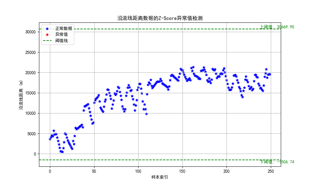
由图能看出来,阈值线大小和threshold取值有关,一般取值为-3和3之间。np.where()函数是寻找所有符合括号内条件的值,并返回一个数组array,其中array[0]存储了所有满足条件的值的下标。视情况而定(感觉不好掌控)。
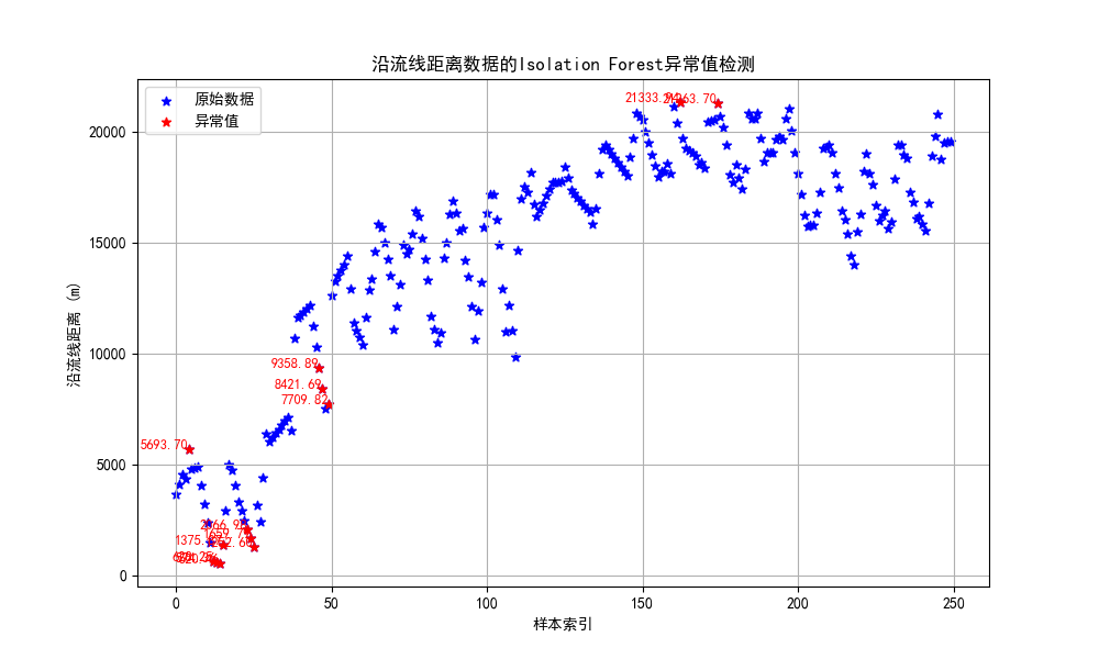
4.4.3 孤立森林
孤立森林:孤立森林是一种经典的异常检测算法,它不需要计算距离等指标来计算样本间的差异,而是借助二叉树通过“疏离程度”来刻画样本间的差异。
cleaned_data = cleaned_data['末端相对于参考点的沿流线距离'].dropna().values

# 将数据调整为列向量
data_reshaped = cleaned_data.reshape(-1, 1)

# 使用 IsolationForest 检测异常值
clf = IsolationForest(contamination=0.05, random_state=2023)
outliers_isolation = clf.fit_predict(data_reshaped)
outliers_isolation = np.where(outliers_isolation == -1)[0]

# 绘制 Isolation Forest 结果图
plt.figure(figsize=(10, 6))
plt.scatter(range(len(cleaned_data)), cleaned_data, c='blue', marker='*',label='原始数据')
plt.scatter(outliers_isolation, cleaned_data[outliers_isolation], c='red',marker='*',label='异常值')

# 标记异常值
for idx in outliers_isolation:
    plt.text(idx, cleaned_data[idx], f'{cleaned_data[idx]:.2f}', color='red', fontsize=9, ha='right')

plt.legend(loc='upper left')
plt.title('沿流线距离数据的Isolation Forest异常值检测')
plt.xlabel('样本索引')
plt.ylabel('沿流线距离 (m)')
plt.grid(True)

# 保存图像
plt.savefig('data_2\IsolationForest_outliers_marked.png')
在创建 IsolationForest 模型时设置了 contamination=0.05,意思是认为数据集中有 5% 的数据是异常值。当使用 IsolationForest检测异常值时,模型会为每个数据点分配一个分数,这个分数反映了该点被认为是异常的程度。分数越低,数据点越有可能是异常值。
reshape()函数:reshape(1,-1)把数组转换为1行;reshape(-1,1)把数组转换为1列。IsolationForest()函数的参数解释:contamination(污染)说明异常数据占所有数据的比例;random_state指随机种子;n_estimators指iTree的数量,一般默认为100个,因为数据显示当iTree数量为100时,样本路径的平均高度趋于收敛。fit_predict()函数:训练和预测一起完成,可以得到模型是否异常的判断,-1为异常,1为正常。
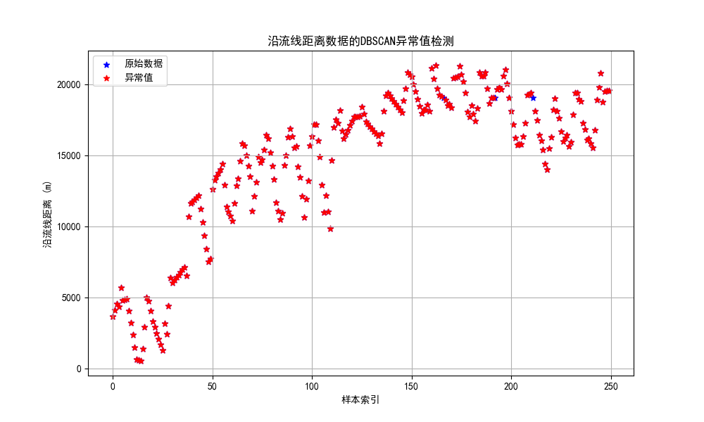
4.4.4 DBSCAN聚类
DBSCAN聚类算法是一种基于密度的异常检测方法。
DBSCAN()函数的参数解释:eps指两个样本之间的最大距离,即扫描半径;min_samples指作为核心点的话邻域(即以其为圆心,eps为半径的圆,含圆上的点)中的最小样本数(包括点本身)。
cleaned_data = cleaned_data['末端相对于参考点的沿流线距离'].dropna().values

# 将数据调整为列向量
data_reshaped = cleaned_data.reshape(-1, 1)

# 使用 DBSCAN 进行异常值检测
dbscan = DBSCAN(eps=1, min_samples=3)
outliers_dbscan = np.where(dbscan.fit_predict(data_reshaped) == -1)[0]

# 打印异常值的索引
print("异常值索引:", outliers_dbscan)

# 绘制 DBSCAN 结果图
plt.figure(figsize=(10, 6))
plt.scatter(range(len(cleaned_data)), cleaned_data, c='blue',label='原始数据',marker="*")
plt.scatter(outliers_dbscan, cleaned_data[outliers_dbscan], c='red', label='异常值',marker="*")
plt.legend(loc='upper left')
plt.title('沿流线距离数据的DBSCAN异常值检测')
plt.xlabel('样本索引')
plt.ylabel('沿流线距离 (m)')
plt.grid(True)
plt.show()
补充
1. 删除 "Unnamed" 列
cleaned_data = data.drop(columns=[col for col in data.columns if "Unnamed" in col])
2.删除索引行
cleaned_data = cleaned_data.drop(index=range(0, 87))
3. 显示负号
plt.rcParams['axes.unicode_minus'] = False
4. 显示中文标签
plt.rcParams['font.sans-serif'] = ['SimHei']


文章有(3)条网友点评
实验
heygirl

啊